Analyzing Tesouro Direto Data [R]
Today’s case is an impact analysis of the pandemic and political scenario on the Brazilian fixed income market using data from the official Tesouro Direto (TD) system.
For this, we will use the R language both for data extraction and processing, and for generating the final visualization. Throughout the article, I will detail all the code used, so that in the future you can generate your own analysis of government bonds using Tesouro Direto data and the R language.
An important note: for extracting TD data, I used the GetTDData package created by UFRGS Professor Marcelo S. Perlin. He has also produced other relevant packages for quantitative finance analysis, and if you are interested in the subject, I highly recommend you check out the other packages and content produced by the professor.
Final Objective
This is the final visualization we will recreate throughout the article, showing the purchase rates of inflation-indexed government bonds (IPCA), the famous NTN-B, with different maturities between 08/2019 and 05/2020. Through it, we observe the impact of the current pandemic scenario on NTN-Bs, highlighting the beginning of stress caused by COVID-19 in March and also the political and institutional stress generated by the departure of Sérgio Moro from the Ministry of Justice in April 2020.

For those unfamiliar with government bonds, a quick intuition for interpreting rates would be: the higher a country’s default risk, the higher the interest rate demanded by the market to justify investing in that bond.
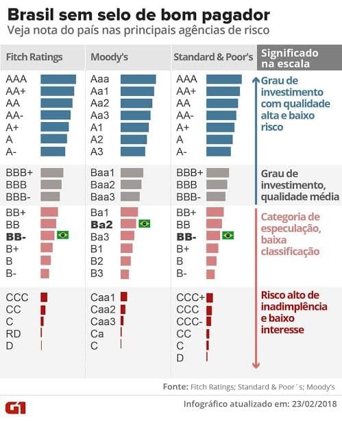
A clear example of this principle is the investment grade (credit rating) that credit agencies like Fitch Ratings, Moody’s, and Standard & Poor’s provide for each country, after analyzing the macroeconomic, political, and public debt scenario. Out of curiosity, here is a visualization from G1 that explains the different rating classifications and their meanings. The visualization is from 2018, when Brazil lost its investment grade, but even though dated, it is extremely useful for strengthening the understanding of country risk.
Anyway, let’s get to the code!
1. Installing packages and dependencies
We will use the following packages:
- Tidyverse: loads a set of packages used throughout the data science workflow in R. For our case, we will use the data manipulation and chart generation packages.
- ggthemes: loads different chart themes to customize our visualization.
- GetTDData: package responsible for extracting data from Tesouro Direto (TD).
- extrafont: loads a set of available fonts for visualization customization.
- ggrepel: package that automatically adjusts data labels so that no label overlaps another.
If you don’t have any of them already installed on your machine, you will need to install the missing packages as follows:
install.packages(c("tidyverse","ggthemes","GetTDData","extrafont","ggrepel"))Next, we load all packages and select the font to be used for our final chart (remember that the font can be changed to any other of your choice).
library(tidyverse)
library(ggthemes)
library(GetTDData)
library(extrafont)
library(ggrepel)
font_import()
loadfonts(device = "win")
custom_font <- "Gadugi"
The font_import() function downloads a set of fonts, the loadfonts(device = "win") function loads the downloaded fonts to make them available in R, and the command custom_font <- "Gadugi" assigns to the custom_font variable the name of the Gadugi font that will be used throughout the visualization.
Tip: To select the desired font, use the
fonts()command to display the names of all fonts loaded by the previous commands.
2. Loading Tesouro Direto data
# download data
download.TD.data(asset.codes = "NTN-B")
NTNB <- read.TD.files(asset.codes = "NTN-B")
After loading the packages, the download.TD.data() function downloads the history from the official Tesouro system and saves all files in a folder called “TD Files”. Then, the read.TD.files() function looks for the “TD Files” folder in your current directory and reads all files inside it, according to the searched argument “NTN-B”.
Tips:
- To check your current directory, run thegetwd()command, and to select a directory of your choice, use the shortcut CTRL + SHIFT + H.
- For selecting multiple bonds, you need to pass a vector with the bond names in the function arguments:assets <- c("NTN-B", "LTN", "NTN-C").
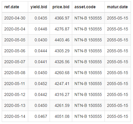
With the tail(NTNB, 10) command, you can quickly check the last 10 rows of the extracted TD dataset.
The dataset contains the reference date (daily), the bond purchase rate, the purchase price, the bond name, and the maturity date.
3. Processing the data
Introduction to the Pipe Operator (%>%)
Before we start processing the data, I will quickly introduce the concept of the pipe operator, because besides being used in our code, it has advantages in code readability and is widely used in the R community, and you may come across it again. For this, I borrowed an example from the Curso-R tutorial that presents a simple and quick-to-understand case of using the operator.

In summary, the pipe operator takes the result of the operation on the left side of the operator and applies it to the function on the right side of the operator. This way, it is possible to chain different actions that occur on a single dataset in a single, highly readable sequence of code.
Back to the filters
Since our goal is to evaluate the impact of the events that occurred in March/20 and April/20 on the bond market, we need to apply some filters to proceed with the analysis.
We will select (i) trades that occurred between October/2019 and May/2020, (ii) NTN-B bonds with semi-annual interest payments to isolate the rate difference between bonds with and without coupons, and finally (iii) select some specific maturities to avoid cluttering the visualization and to evaluate the impact at different maturities.
# wrangle the data
NTNB %>%
  filter(matur.date %in% venc_ntnbs,
         ref.date > as.Date("2019-08-01"),
         !str_detect(asset.code,"Principal")) %>%
  mutate(taxa = yield.bid*100,
         NTN_B = format(matur.date, "%Y/%m"),
         label = if_else(ref.date == min(ref.date),
                         format(matur.date, "%Y"),
                         NA_character_)) %>%
  arrange(NTN_B,desc(ref.date), .by_group = TRUE) %>%
  select(-c(yield.bid, asset.code, price.bid)) %>%
We create a vector venc_ntnbs with the selected maturities in 2020, 2024, 2035, and 2050 to filter by maturity.
Then, we filter observations whose matur.date variable matches one of the selected maturities in the venc_ntnbs vector. For this, we use the %in% operator inside the filter function. The second filter selects observations whose ref.date trading variable is before 2019-08-01. The last filter selects observations that do not contain the text “Principal” in the asset.code variable.
With the mutate function, we can create several variables at once quickly. First, we multiply the yield.bid column by 100 for better visualization in the chart, then we create the NTN_B variable containing the year and month of maturity in the (YYYY/MM) format, and finally we use a condition with the if_else() function to create the label variable, containing the maturity year in the first observation and NA in the remaining observations to create the maturity label in the chart.
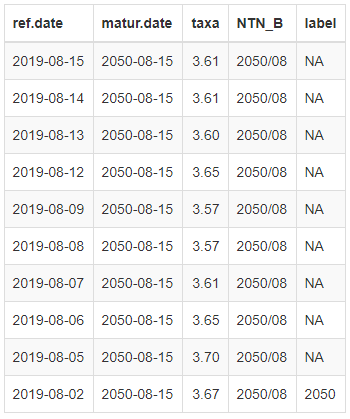
Finally, the arrange() function sorts the table by the NTN_B and ref.date variables, and we remove the yield.bid, asset.code, and price.bid columns with the select() function. Below is the output of the tail(NTNB, 10) command.
4. Building the visualization
Now we enter the most complex part of the code due to the use of numerous distinct functions, each with several arguments. Since it would be impractical to explain item by item, I will provide an overview of which functions generate the main elements of our final chart, giving you the resources to find answers to future questions about the complete code in the function documentation. Additionally, questions and/or suggestions in the comments are also welcome. =]
Initially, just these two lines from the ggplot2 package (contained in the tidyverse package) are capable of generating our chart. However, although the visualization is informative, it is not at all aesthetically appealing.
# continuando do pipe acima, temos:
ggplot(aes(x = ref.date, y =  taxa, color = NTN_B)) +
geom_line(size = 1.5) +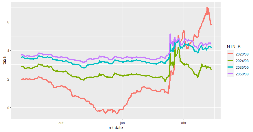
To aesthetically improve our visualization, we need to customize the chart elements as a whole, adjust axis names and titles, add credits and source, replace the legend with labels inside the chart showing only the maturity year, and finally highlight the key periods using lines, arrows, and labels.
So, starting with the highlights of our analysis, I used the geom_vline() function to create vertical lines for each of the days, the geom_label() function to create labels with the text “Corona Day” and “Moro Day”, and the geom_curve() function to create curves connecting the labels to the vertical lines. For all functions, it is necessary to specify, through the arguments, the positions of the elements on the axes, along with colors and specific elements. Additionally, I used the geom_label_repel() function from the ggrepel package to create labels with each bond’s maturity.

Next, I renamed axes and titles, added credits and source using functions like ggtitle(), xlab(), ylab(), and caption(). I also added a chart theme according to my personal taste, using the theme_clean() standard from the ggthemes package. Additionally, some internal adjustments to the chosen theme were necessary using the theme() function, such as removing the legend (which was no longer needed) and centering the title.
Tips: (i) Try using different themes from the ggplot2 package as well as ggthemes to discover various chart themes that may appeal to you. (ii) By making adjustments inside the theme() function, you can customize ANY element of your chart.

Finally, I chose a different color palette with the scale_color_brewer() function and made adjustments to the date and rate scales with the scale_x_date() and scale_y_continuous() functions, adjusting the date format and rate decimal places. After that, I used the ggsave() function to set the desired dimensions for the chart, resulting in our final visualization.
If you wish to download and reproduce the complete code, access this link on github.